

Publishing a paperback book involves much more than simply writing content. One of the most important steps in the publishing process is formatting, which ensures that your book not only looks professional but also meets the technical standards required by printers and distributors. Without proper formatting, your paperback may appear unpolished, making it harder to appeal to readers and potentially causing printing issues. This is why understanding a paperback book formatting example can be extremely beneficial for authors, whether they are self-publishing or working with a traditional publisher.
Formatting involves adjusting the text layout, margins, fonts, chapter headings, page numbers, and other design elements so that the book is visually appealing and easy to read. A poorly formatted paperback can distract readers, while a well-formatted one enhances the reading experience and gives your book a professional finish. Think of formatting as the bridge between your manuscript and the printed version that readers will hold in their hands.
Many new authors underestimate the importance of formatting until they encounter issues with text alignment, awkward spacing, or images that do not print correctly. By following a tested paperback book formatting example, you can avoid these pitfalls and produce a high-quality final product. This is not just about aesthetics, but also about compliance with the printer’s technical specifications. In the competitive world of publishing, even small details can make a big difference in how your book is perceived.
In this article, we will explore key elements of paperback formatting, review examples of professional formatting, discuss common mistakes, and share tips on achieving a polished look without unnecessary stress.
Understanding A Paperback Book Formatting Example
A paperback book formatting example typically includes all the design elements that make a printed book look consistent and professional. This includes setting the correct trim size, which determines the dimensions of your book. Common trim sizes for paperbacks include 5 x 8 inches, 5.5 x 8.5 inches, and 6 x 9 inches, but the right choice depends on your genre and audience preferences.
The interior layout is another critical aspect. A good example will show you how to manage margins so that text is not too close to the binding or cut off during printing. It also guides font selection, usually recommending serif fonts such as Times New Roman or Garamond for body text, as they are easier to read in print. Chapter headings should be styled consistently, with clear spacing before and after, to give a clean, organized look.
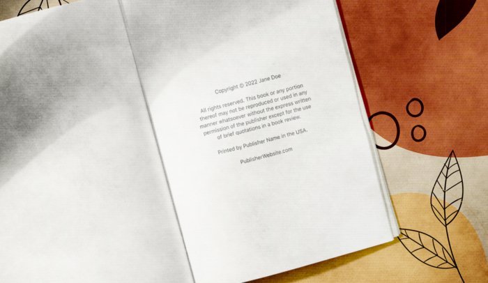
Additionally, a well-structured paperback formatting example includes correct page numbering. The example may also cover how to handle front matter such as the title page, copyright page, dedication, and table of contents, as well as back matter like acknowledgments and author bios.
Publish my book is a common aim for authors ready to share their work with the world. Whether choosing traditional routes or self-publishing platforms, writers can prepare their manuscripts and decide how to distribute their books effectively to reach readers.
Essential Elements Of Professional Paperback Formatting
Professional paperback formatting goes beyond just making your book look neat. It also ensures that the reading flow is smooth and visually appealing. A strong paperback book formatting example will cover:
- Line spacing: Standard print books often use 1.15 or 1.5 line spacing for readability.
- Paragraph style: Indented paragraphs without extra spacing between them are common in fiction, while non-indented paragraphs with space between them are often used in non-fiction.
- Headers and footers: These may include the book title, author name, or chapter title, along with page numbers.
- Image placement: Images should be high-resolution and placed strategically to avoid disrupting the text flow.
When using a formatting example, pay attention to alignment and justification. Most paperbacks use fully justified text, which creates clean edges on both sides of the page. Also, ensure that hyphenation settings are optimized to avoid awkward breaks.
Common Mistakes To Avoid In Paperback Formatting
Even with a reference, authors sometimes make mistakes that can hurt the final look of their paperback. One frequent issue is using fonts that are too small or too large, which can strain the reader’s eyes or make the book appear unprofessional. Another mistake is ignoring margin requirements, which can lead to text being cut off near the binding.
Overcomplicating chapter headings with decorative fonts or excessive styling can also detract from readability. Similarly, failing to standardize spacing, alignment, and indentation throughout the manuscript can create an inconsistent and messy look.
Some authors skip reviewing the printer’s guidelines, which can result in files being rejected or requiring costly revisions. This is why following a tried-and-tested paperback book formatting example can save time, money, and frustration.
Practical Tips For Formatting Your Paperback
To format your paperback effectively, start by choosing the right software. Tools like Adobe InDesign, Microsoft Word (with proper settings), and Scrivener are popular choices. InDesign offers the highest level of control, but Word is more accessible for beginners. Templates are also available from print-on-demand services like Amazon KDP and IngramSpark, which provide ready-to-use layouts based on your chosen trim size.
When working with your manuscript, apply consistent styles for headings, body text, and other elements. Avoid manual spacing or random formatting changes, as these can cause issues later in the printing process.
Ebook publisher platforms like Amazon KDP, Smashwords, and Apple Books make it easy for authors to distribute digital versions of their books. These services support various formats and give access to large online markets, often with simple upload and pricing tools.
Formatting is an essential step in turning your manuscript into a polished, professional paperback. By learning from a paperback book formatting example, you can understand the best practices for layout, margins, font choices, and page numbering. Avoiding common mistakes like inconsistent styles or ignoring trim size requirements will save you time and improve your final result.
For authors who want their work to stand out, investing time in proper formatting is as important as writing the content itself. Whether you are self publishing or working with a printing service, using a solid reference will help you produce a book that meets professional standards. With the right approach, your paperback will not only look great but also provide readers with a seamless and enjoyable reading experience.

